 May
06
Vogue’s 10 Best White Paint Colors
- May 6, 2017
- 0 Comment(s)
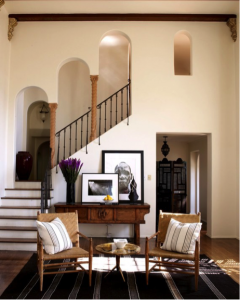
Photo: Courtesy of Martyn Lawrence Bullard
White paint is great because it’s timeless, and never goes out of style. It works as a great neutral and can be mixed well with any style. According to Vogue, here are their designers’ top 10 White Paint Colors.
Benjamin Moore White Opulence (OC-69). “It has a beautiful, warm glow to it that works perfectly over plastered walls, especially in a period home like Ellen Pompeo’s Hollywood Hills sitting room. The way the light catches this particular paint hue makes a really special backdrop to display sculptural furniture and art against, whilst retaining a cozy living environment.”-Martyn Lawrence Bullard.
Benjamin Moore China White (PM-20). “This is one of my favorite off-white colors to use. It has the slightest touch of gray in it to give the color some depth and keep it from being too stark.” -Reagan Hayes
Benjamin Moore White Dove (OC 17). “This is our go-to white because it reads crisp and clear and has a warm, creamy feel. If a white is too pure, it will contrast too sharply with other colors, or feel icy if used to coat a room.” -Carrier and Company.
Benjamin Moore Distant Grey (2124-70). “It is not too cool or too warm and works beautifully in a house that gets a full range of light all year. It is the perfect backdrop for strong colors or neutrals.” -Jon Maroto of Flair.
Farrow and Ball Cornforth White. “It’s such a versatile white that works in any room, in any light. It has a warm undertone that makes it more interesting than a basic bright white.” -Birgit Klein.
Benjamin Moore White Dove (OC-17). “We’ve fallen in love with white walls over the past couple of years, and this is our go-to. It’s a very livable white—clean with a hint of cream—so it never seems shocking or primer-like. This can be a problem with bright whites, we’ve found—rooms can end up looking unfinished.” – Betsy Burnham.
Farrow and Ball Pointing. “Pointing is our go-to white for updated traditional interiors. It is warm and rich—a true classic creamy white that offsets both classic and modern furnishings.”-Pappas Miron.
Farrow and Ball Pointing.“My favorite wall color—especially for a big room—is white. Particularly this shade from Farrow and Ball. Nothing is more versatile and it brings so much light into a room.” -Lilly Bunn.
Farrow and Ball Pointing. “This is our favorite white—not too white and not too creamy—which is a hard balance to strike. It glows in the sunlight and provides a clean backdrop for showcasing artwork.” -Tilton Fenwick.
Farrow and Ball Strong White. “I don’t often use a pure white, but recently I’ve been using this white in many of the interiors of an early Georgian house we’ve been working on. It’s a beautiful, serene, soft color, without too much warmth or creaminess—a perfect chalky white.”-Ben Pentreath.
Which is your favorite white?!
http://www.vogue.com/article/best-white-paint-colors-interior-designers
Story written by VIRGINIA VAN ZANTEN Vogue Magazine

